Unified B2B EdTech Ecosystem for Global Language & Skills Training
Transforming complex corporate training into a habit-forming digital experience through AI-powered conversational tools and a simplified, goal-oriented user interface.
My role included building a design system from scratch, designing AI-powered conversation tools like, and simplifying the core learner homepage to drive engagement, by changing user behavior. By integrating design earlier in the product lifecycle, I ensured that every release balanced pedagogical goals with scalable B2B enterprise needs.
I also transformed the design department’s operations by shifting from a reactive ticketing system to a proactive, discovery-led process.
Toolkit
Design: Figma, FigJam
Research: Hotjar, Google Analytics, Card Sorting
Strategy: Competitive Audit Matrix, HMW Frameworks
Dev Handoff: Jira, Supernova
Homepage & Navigation redesign and user behaviour change
The Impact: A Foundation for Scalable Growth
The redesign of the Learnlight ecosystem was more than a visual refresh; it was a shift toward a more mature, data-informed product culture. By implementing the 'Rule of Three,' we transformed a fragmented dashboard into a guided, intentional experience that respects the learner’s time and cognitive energy.
The Results:
Operational Efficiency: The transition to a proactive discovery process significantly reduced development 're-work' by validating concepts before they reached the engineering phase.
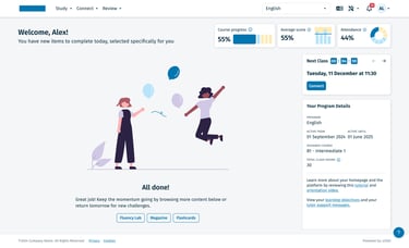
Smarter Engagement: The introduction of the 'All Done' state and daily refreshed To-Dos created a clear 'habit loop,' giving learners a sense of daily accomplishment that was previously missing.
Contextual Program Details: By keeping program specifics visible yet secondary to the daily tasks, we ensured users always understood their long-term progress without it cluttering their immediate workspace.
Scalable Consistency: The new tokenized Design System (detailed in the next project) ensured that these changes were not one-off fixes, but part of a scalable framework that now allows for faster feature releases and a unified global brand.
*This was recently launched, so not exact metrics yet. But, the user feedback was encouraging: most of them appreciated the change and the support team received less complaints of user not knowing what to do next in their learning journey.
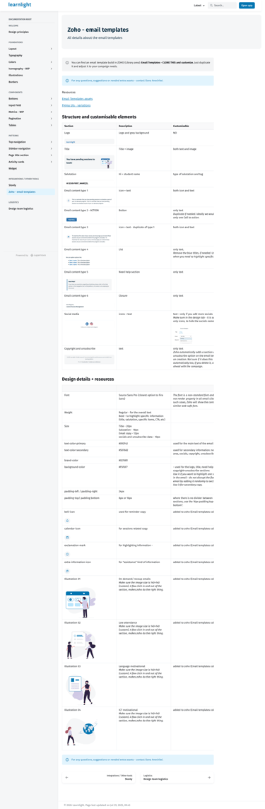
Architecting a Living Design System: From Figma to Supernova
The Challenge: Building the Plane While Flying It
The need for a Design System at Learnlight didn't happen in a vacuum—it was born out of the Homepage and Navigation redesign. As we defined new elements, it became clear that we needed a scalable engine to support them. I began building the new Design System in tandem with these live features, ensuring every new component was born from a real-use case rather than an abstract library.
The Strategy: A User-Centric Documentation Model
A Design System is a product in itself, and its users are the internal team. I began by identifying our key personas—Designers, Frontend Developers, Product Managers, Testers, and Marketing—and conducted interviews to understand their specific needs.
To house our source of truth, we compared ZeroHeight and Supernova. We chose Supernova, because of its simplicity and it catering our needs better. I architected a page structure tailored to our diverse user base:
For Devs/Designers: Naming conventions, component behavior, and token structures.
For Product/Marketing: Brand guidelines and high-level patterns.
For QA: Interaction states and edge-case documentation.
The Execution: Collaborative Architecture
To ensure adoption and technical feasibility, I established regular alignment meetings with the engineering team. Together, we defined:
Naming & Structure: Aligning Figma layer names with React component props to speak a single language.
The Iterative Build: I built the Figma library step-by-step, prioritizing components as they were needed for the roadmap. This 'just-in-time' approach prevented the library from becoming bloated with unused elements.
The Handoff Loop: I owned the end-to-end handoff process, moving from high-fidelity designs to detailed implementation checks, ensuring that the final code matched the design intent perfectly.
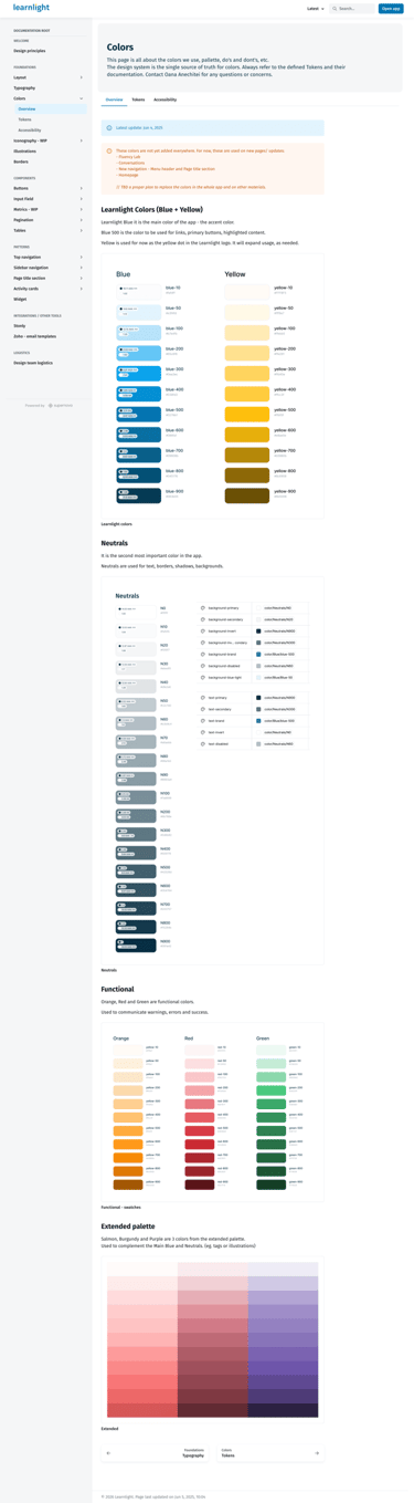
Establishing the foundations was an exercise in balancing high-level brand vision with technical and inclusive requirements. We didn't just pick colors; we built a functional system designed for a global, diverse audience.
The Color & Typography Challenge: Our stakeholders envisioned a modern, pastel-themed aesthetic. However, I had to ensure our choices met WCAG AA accessibility standards. I led an iterative process of testing pastel palettes against contrast ratios, eventually landing on a 'refined pastel' scheme—maintaining the desired brand 'vibe' while ensuring the platform remained fully legible for all users. Alongside this, I implemented a new typography system to improve readability across long-form learning content.
The Grid & Spacing System: To move away from fragmented layouts, I defined a strict 8px spacing scale and a responsive grid system. This created a visual rhythm that made the complex 'Rule of Three' homepage feel organized and intentional.
Engineering Alignment & Evolution: A Design System is never truly 'done.' Later in the process, I led a second analysis of our page layouts based on direct feedback from the engineering team. We identified areas where the initial layouts created unnecessary development complexity. I pivoted the design of several core templates to be more development-friendly and responsive, ensuring the platform looked as good on a tablet during a commute as it did on a desktop in an office.
Finality: The Scalable Engine
By the end of the project, the Design System had transitioned from a few shared components to a robust, documented ecosystem. It served as the foundation for the entire Learnlight platform, turning a chaotic UI into a predictable, high-quality experience. This collaborative foundation not only sped up development but also empowered the whole team—from testers to marketing—to work with a shared understanding of our product’s visual and functional DNA.
AI-Driven Learning: Designing the Future of Human-Language Interaction
Strategic Roadmap: Expanding the AI Trainer Ecosystem
Beyond these two solutions, I led strategic discussions on how to expand AI capabilities across the entire user journey. We mapped out several opportunities to integrate the 'AI Trainer' persona into the platform’s core:
Personalized Onboarding: Using natural conversation to assess a learner’s level and goals during setup.
Dynamic Recommendations: Evolving from static paths to an AI engine that suggests content and goals based on real-time performance.
Continous Support: Exploring how AI can act as a continuous co-pilot, providing context and encouragement across every module of the app.
Impact: From Tasks to Continuous Learning
These AI solutions successfully shifted the platform's value proposition. By providing immediate, intelligent feedback and a dedicated space for practice, we gave learners the confidence to perform better in their live sessions. This initiative proved that AI, when used strategically, can significantly enhance the human-led learning experience rather than replace it.
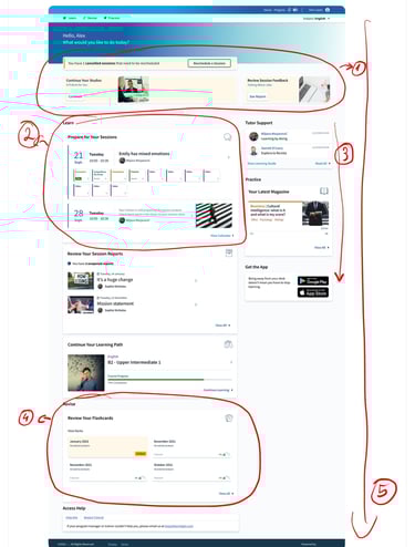
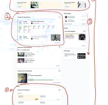
The Problem: The "Everything, Everywhere" Interface
The original Learnlight homepage suffered from cognitive and choice overload. Learners were met with a cluttered page that attempted to show every possible things to do at once. This led to 'decision paralysis,' making it difficult for users to identify their next immediate step, but also enforce a behaviour where they did the minimum required for the course to advance, but during more hours in one day in a week.
The navigation of the platform also had all possible options visible in a multi level tabs system and this added to the cognitive and choice overload.
(1) The Hero Section: "The Attention Battle", (2) The "Learn" Section: "Information Density", (3) Right Sidebar: "Functional Fragmentation", (4) The "Revise" Section: "Cognitive Load", (5) Page Length: "The Scroll Problem"
The Strategy: Radical Simplification
My goal was to shift the interface to a guided experience. Leveraging insights from user interviews and platform analytics, I identified that users would be more successful with shorter time on site, but on a daily basis, to build a new habit. Together with the Product team and main stakeholders, we agreed on the Rules of three approach, for both the homepage and navigation.
The Process: From Discovery to a "Rule of Three" Architecture
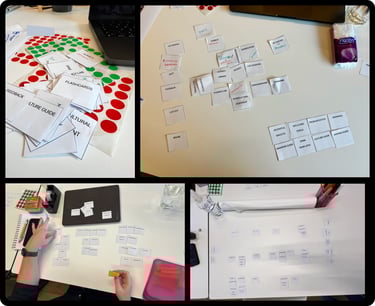
Moving away from a reactive workflow required a rigorous discovery and co-creation process. I led a series of cross-functional workshops to ensure that our technical constraints and pedagogical goals were aligned before we touched a single pixel.
Phase 1: Strategy workshop & Design Sprint exercises
We began by aligning the cross-functional team on a singular vision:
Long-Term Goals & HMWs: We defined our 'North Star' and framed challenges as 'How Might We' statements to ensure we were solving for long-term retention, not just UI fixes.
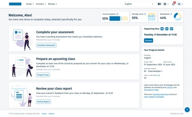
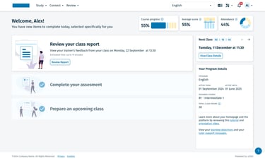
Ideation & Heatmaps: Through individual sketching and a Heatmap of Ideas, the team gravitated toward a minimalist approach. This led to the 'Rule of Three'—a concept to limit daily focus to 3 metrics and 3 tasks.
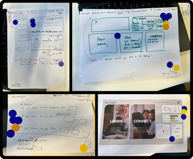
Prototyping: I built a high-fidelity prototype to bring these concepts to life for testing.
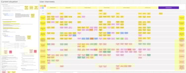
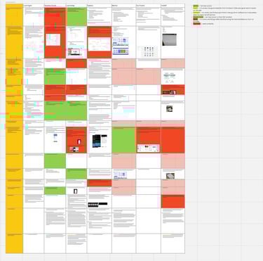
Phase 2: Targeted Competitive Research & Benchmarking
Once we had our core concepts, I conducted an extensive competitive audit to 'stress-test' our direction against industry leaders. I analyzed six dimensions: Navigation, Learning Journey, Gamification, Content Types, Accessibility, and Mobile/Support.
The Grading System: I developed a comparative matrix to grade these capabilities, identifying exactly where our proposed 'Rule of Three' would give Learnlight a competitive edge in clarity.
Data Triangulation: I cross-referenced these findings with Stakeholder Interviews, Hotjar heatmaps, Learner Support tickets, and analytics data. This confirmed that while competitors were adding features, our path to success lay in radical simplification.
Phase 3: Final Architecture & Transition
With the data validating our minimalist direction, I finalized the 3x3 hierarchy (Study, Connect, Review). To ensure a smooth transition for our global enterprise users, I designed an intermediary navigation (Learn, Revise, Practice) that acted as a bridge while the new platform logic was rolled out.
Why Three? Humans are neurologically wired to process information in small chunks; by limiting choices to three, we effectively eliminated decision paralysis.
A critical part of this redesign was defining the 'end of the journey' to create a sense of accomplishment. We introduced a celebratory 'All Done' state that appeared once the daily To-Dos were completed.
The Challenge: Providing 24/7 "Safe" Practice
Live sessions with trainers are the most valuable part of Learnlight, but they are a finite resource. Learners often felt a 'confidence gap' between studying static content and speaking in a live environment. The AI Initiative was launched to provide a low-stakes, 24/7 environment where learners could practice and receive immediate correction without the anxiety of a live audience.
Solution 1: The AI Practice Conversation Tool
I designed a dedicated conversational interface that allows learners to engage in real-time dialogue grounded in Learnlight’s pedagogical content.
Conversational UX: I built a flexible chat-based framework designed for high-frequency use. While the initial release focused on text, I architected the interface to be 'voice-ready,' allowing for a future transition into audio and video-based AI Trainers.
Content-Aware Intelligence: Unlike generic AI, this tool was designed to recognize the learner’s specific course context, ensuring that practice remained relevant to their current learning goals
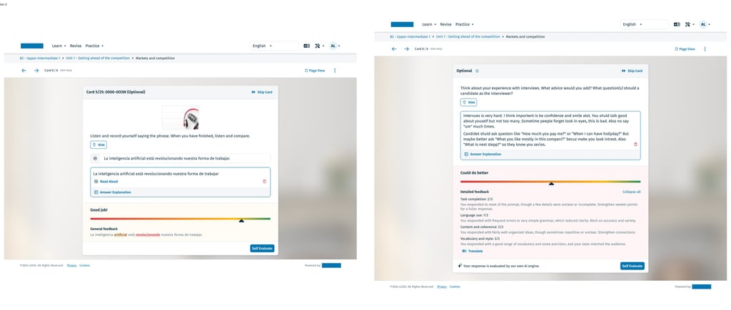
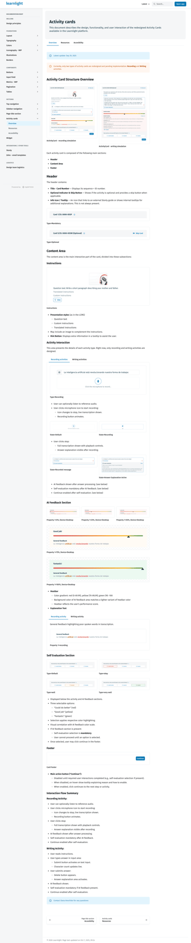
Solution 2: AI Feedback on Activity Cards
To provide immediate value during the study phase, I integrated AI-powered feedback directly into our standard activity cards.
Immediate Correction: I designed a feedback system that goes beyond 'Right/Wrong.' The AI analyzes the learner’s specific input—identifying nuances in grammar and vocabulary—and provides instant, encouraging corrections.
The 'Micro-Coaching' Moment: These cards were visually designed to highlight 'Learning Moments,' which users could then save to their Review section, turning a simple exercise into a long-term learning asset.